

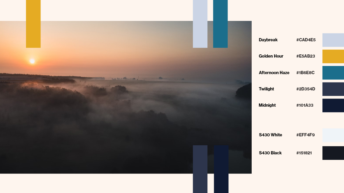

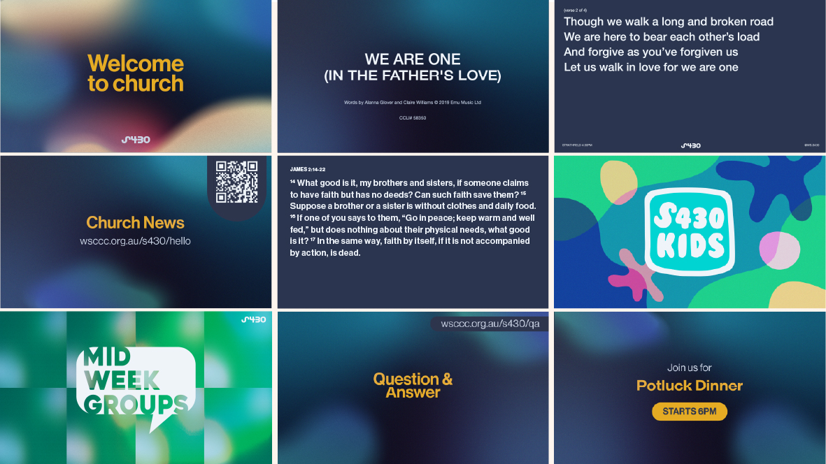

S430 is the only night service at this particular church, so it is only natural that the design acknowledges this. Additionally, the following characteristics were required of the brand identity:
The items made to embody these characteristics include the logo, brand colours, typography and service slides.
The colour palette was chosen based on the twilight hours. It embraces that S430 is the only evening service at this church and, more deeply, that the gospel can shine even in the darkest hours.
For the logo, the motion of the Strathfield “S” in the logo captures the pattern of the Christian life. It is humiliation then exaltation, repentance then salvation, death then life—it is the path Christ took so it is the path S430 walks down together. And at the centre is the cross, the focal point of our faith, sometimes unseen but always present.
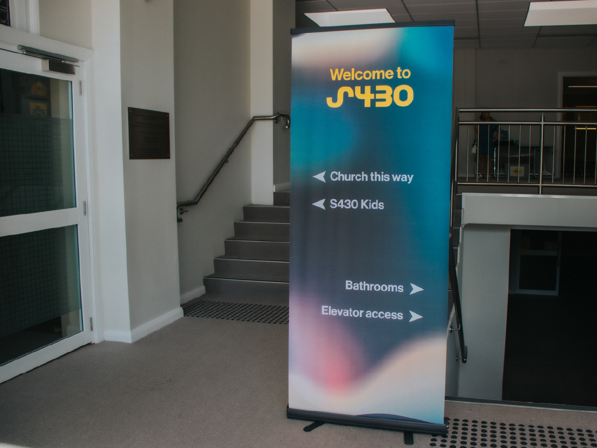
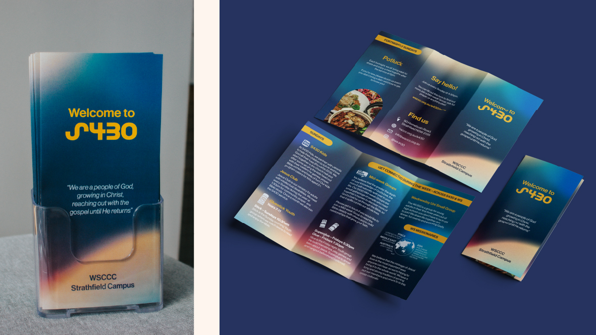
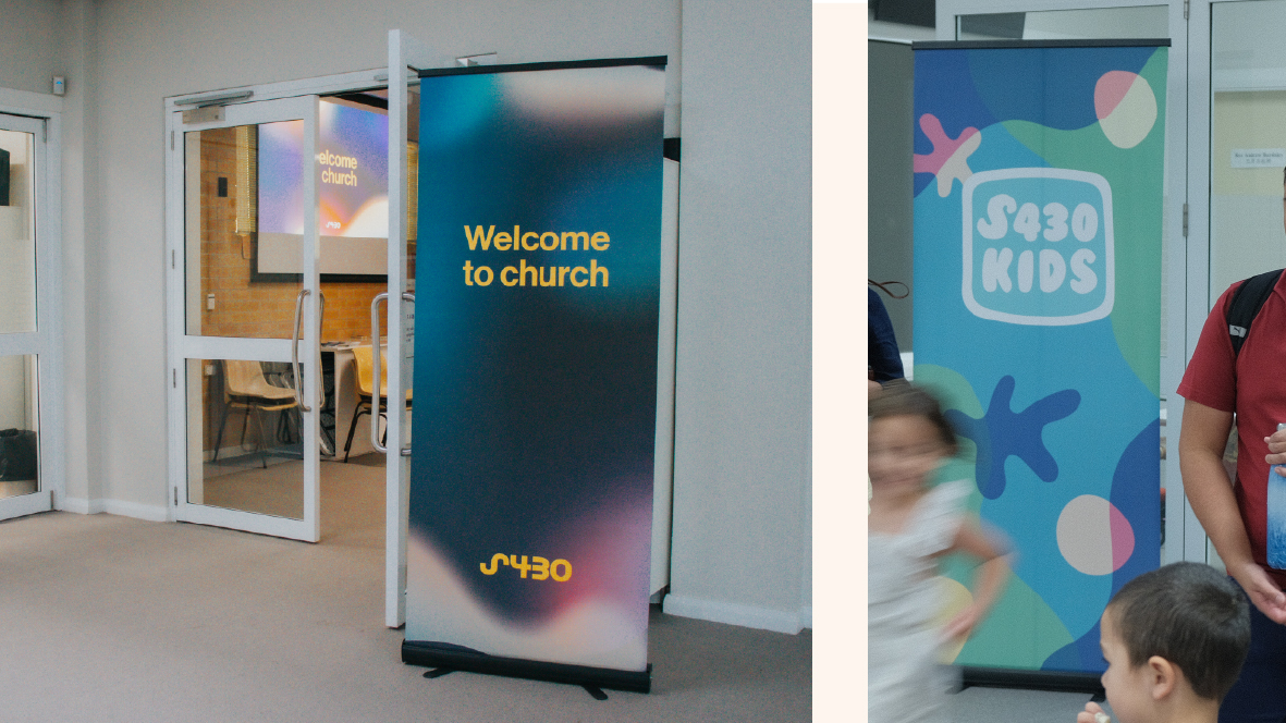
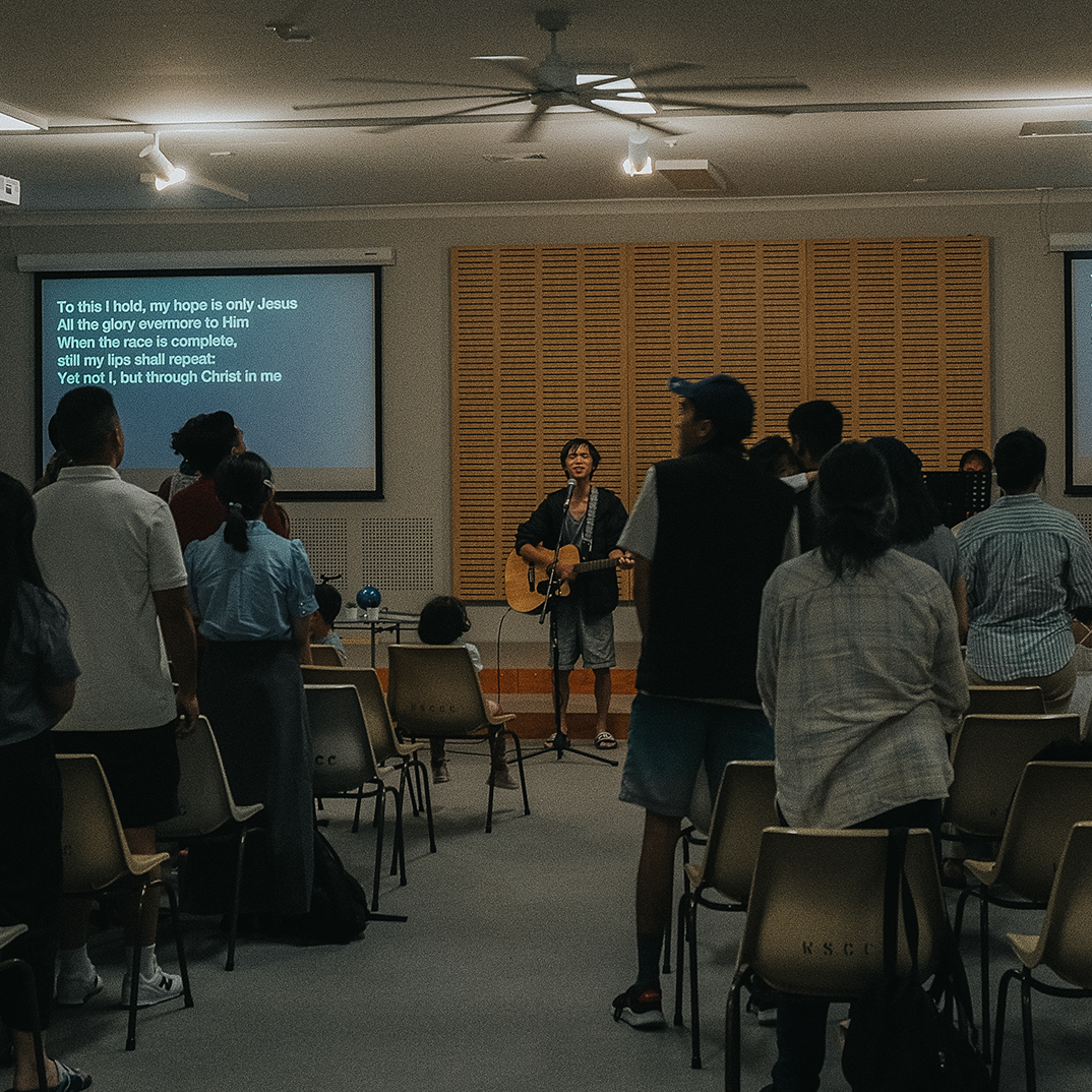
On site, the interior of the building was very grey, lifeless and devoid of any character. It reflected the transient nature of the usage of the space as many services and different people groups used the space regularly. In order for S430 to feel vibrant and “warm and welcoming”, I designed a few pull up banners, a brochure and a few other small signs (not pictured) that would inject colour, warmth and also demarcate the facilities. This made the interior feel functional but also made S430 feel like it was inhabiting the space as opposed to it just being another cog in the wheel. Combined with the service slides, this cohesion in the visual identity of S430 made way for the congregation to feel an emotional attachment to each other which was not previously there.