
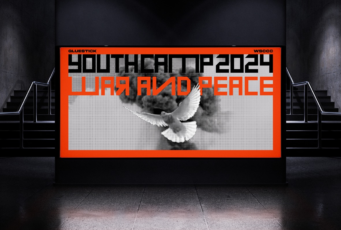
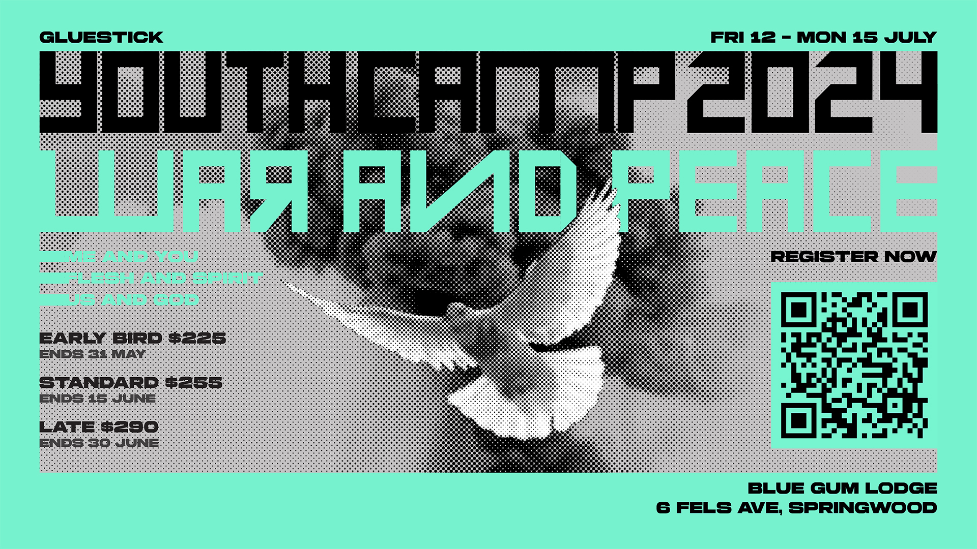
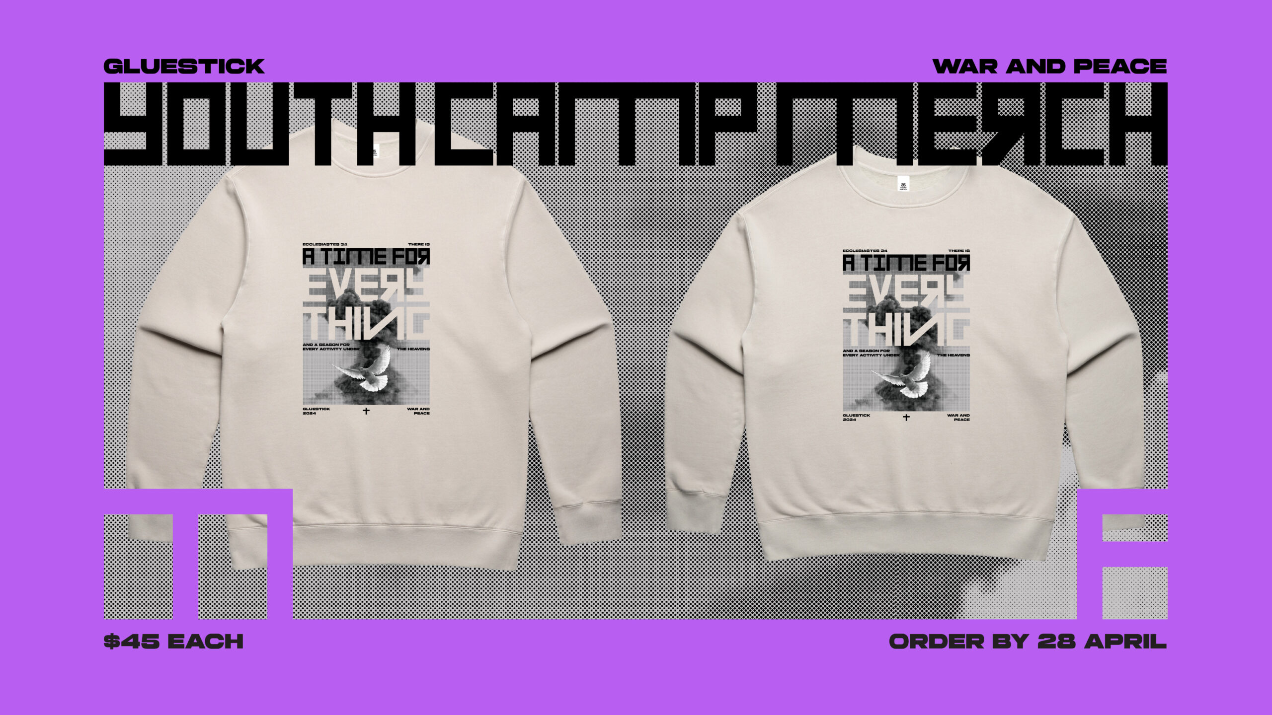
The theme of the youth camp was “War and Peace” in a spiritual sense, so the desire was to create content that reflects the dynamic contrast of the theme while still being appropriate (and “slay” enough) for high schoolers and their leaders. One specific request was to make the jumper design feel like the kind of gritty band merch you would get at a concert.
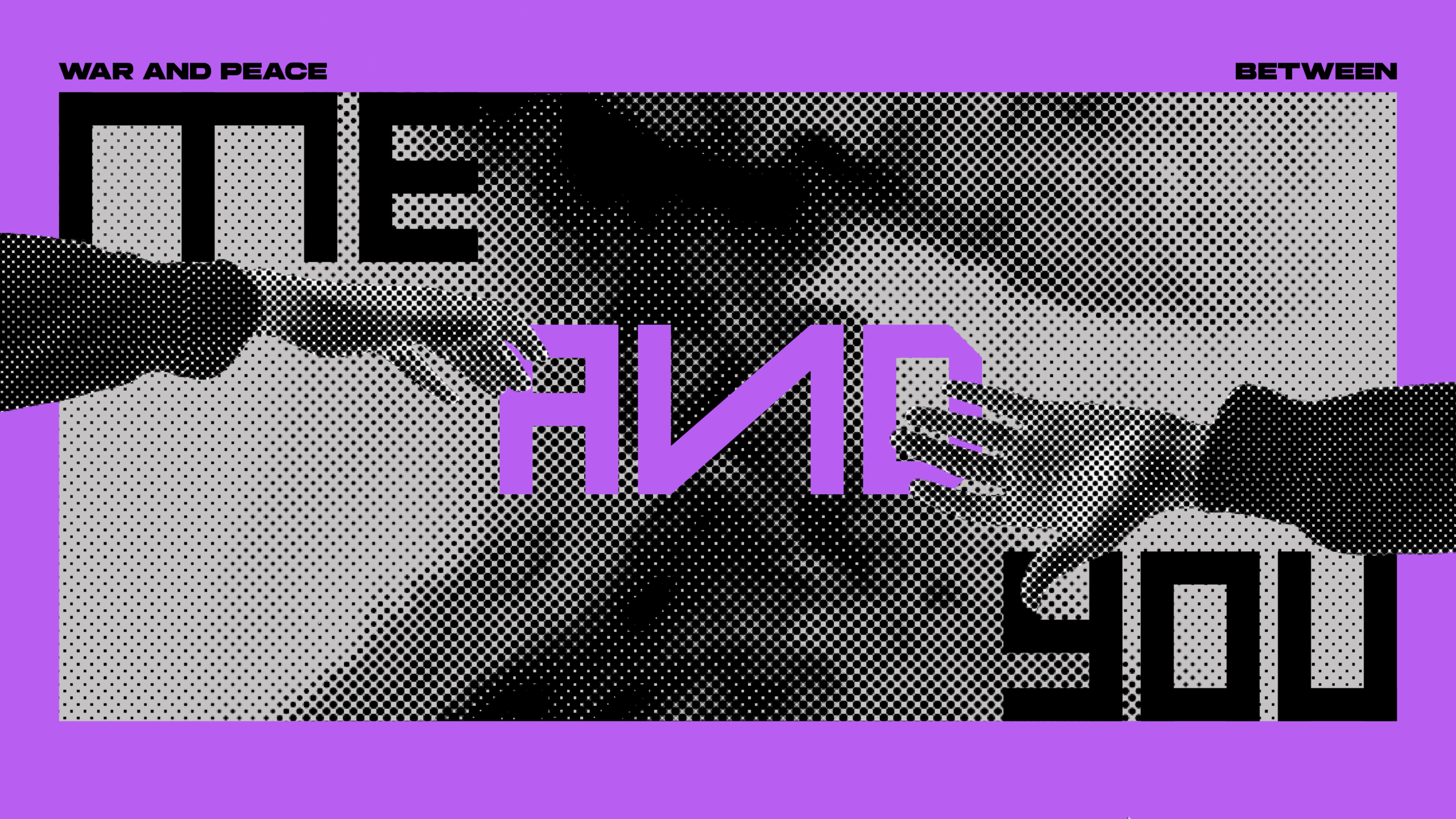
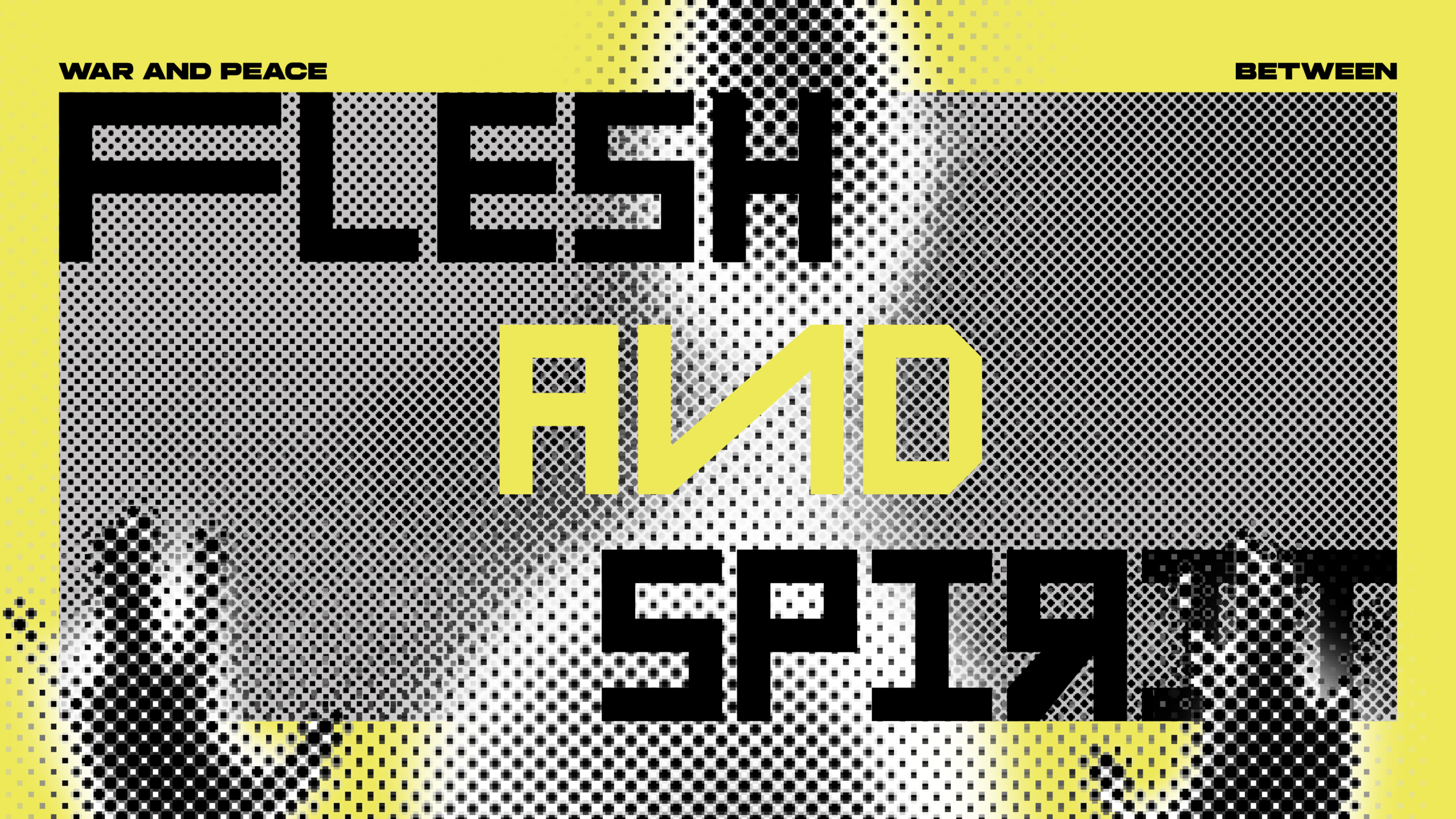
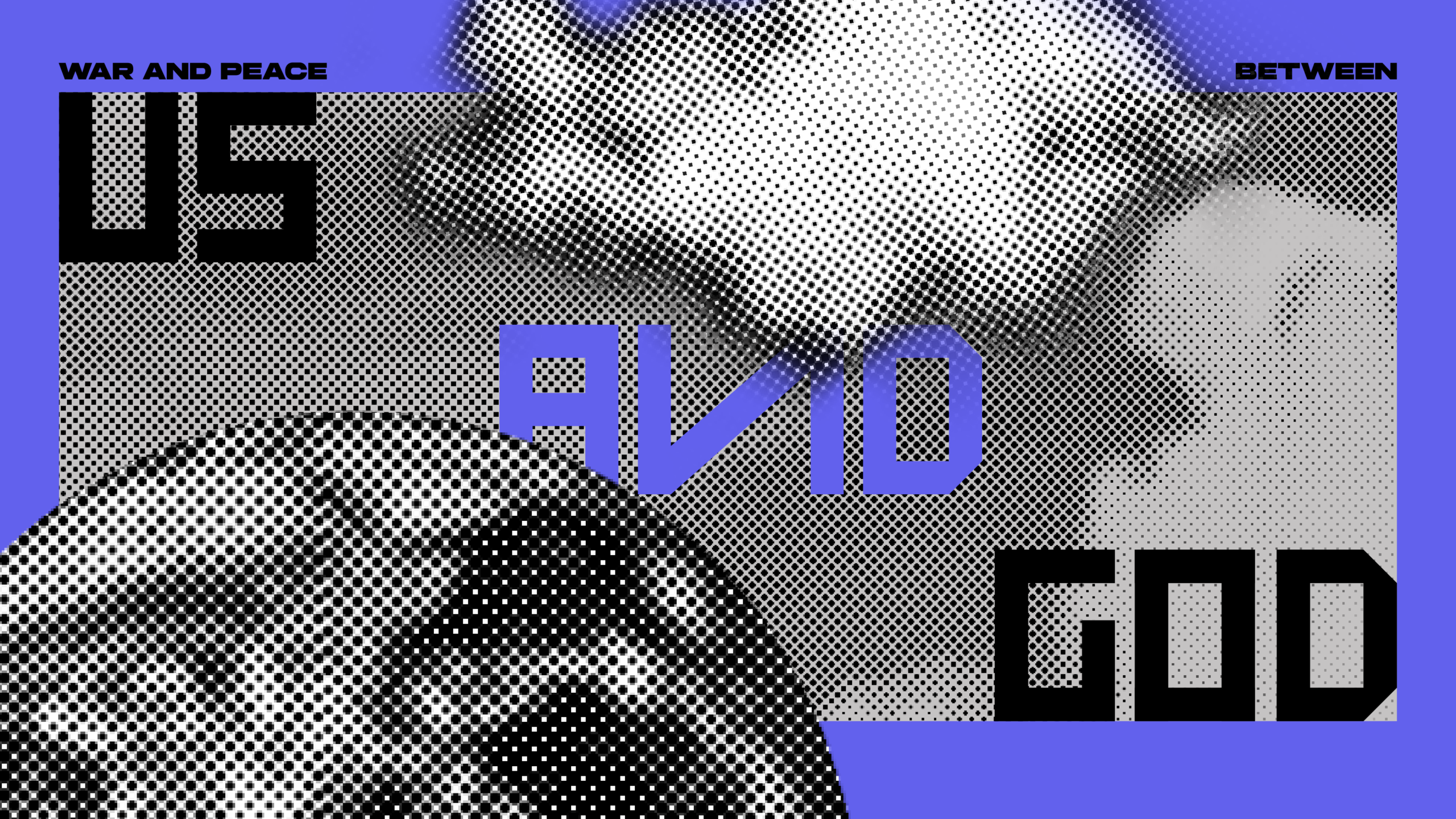
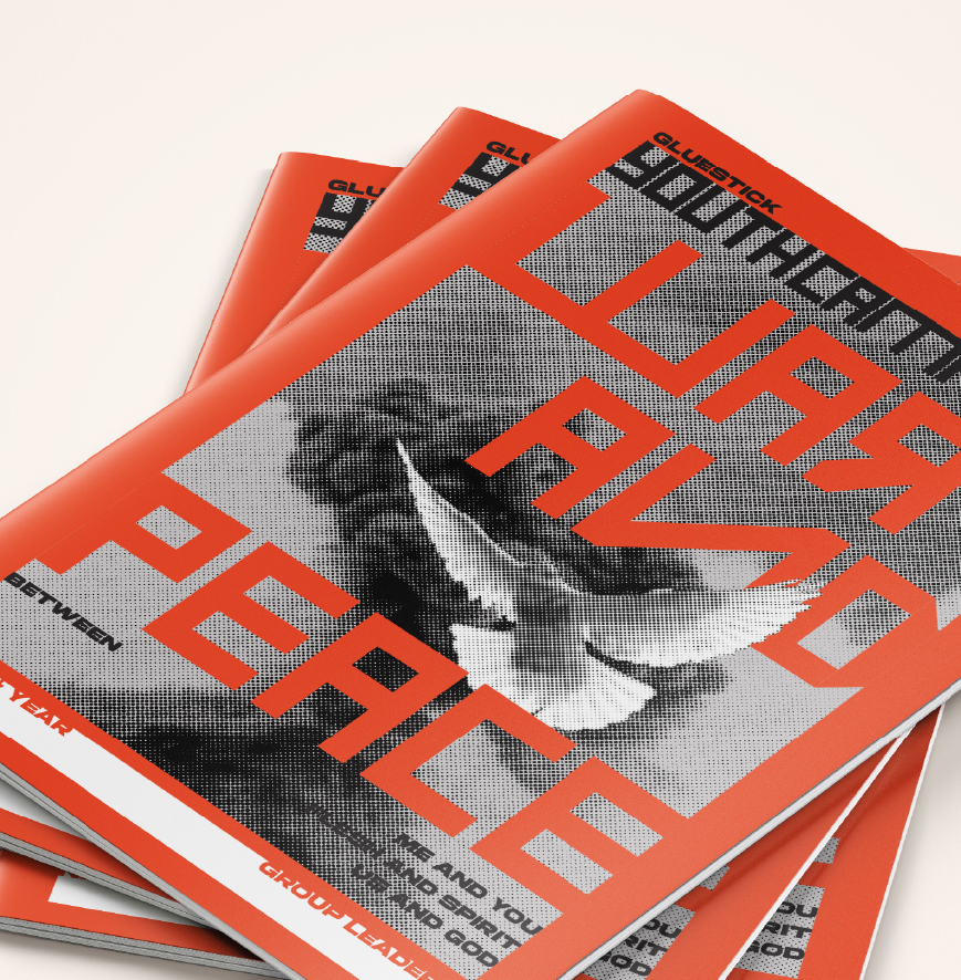
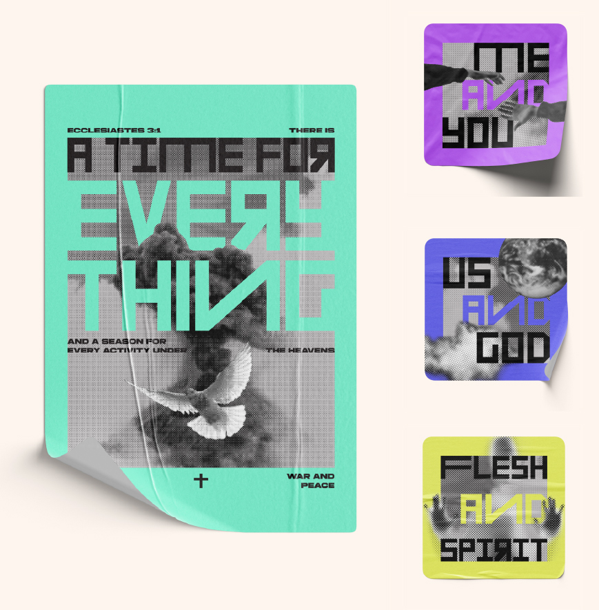
The three talks featured at the camp were titled War and Peace between: me and you, us and God and flesh and spirit.
I began my research by turning to war propaganda from the 1940s and subsequently, the post-war architectural movement of brutalism.
A notable feature of war propaganda were the striking primary colours used in their posters. For this project I chose to use electric colours instead, as it conveys a more sharp, high voltage energy. The vibrancy of these colours seem to be more approachable and suitable for the intended audience.
The bold colours are also particularly effective against the grainy halftone images and offset the harsh nature of the brutalistic font. I actually made this font to convey the gritty band merch feel. The halftone effect also dulled the intense nature of the camp theme. Only three colours were used in the screen printing of the jumpers – combined with the halftone effect, it almost looks like a newspaper print against the faded bone colour of the fabric.